I've been busy lately trying to do all the things I'm supposed to do, plus get Teen1 ready for graduation and her trip to England, plus get a party organized for Sunday, plus work... and I'm afraid blogging has taken a back seat. And will continue to for the next week or so. Sorry. How about if I show you what I do at work?
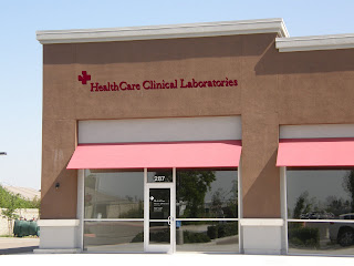
 We make signs and part of our job is to show the customers how beautiful the proposed sign will look. So first I go out to their location and take a photo of the storefront.
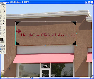
Then using PhotoShop I add the proposed sign to the photo. Notice those black triangles in the corners? I put those on the artwork in my vector based program before I imported it to PhotoShop. They help with size and perspective. Above you see how it looks before adjusting for perspective. Below I have started the process by rotating it a little...

and now I have adjusted the perspective using Transform>Distort. I simply adjusted the corners to match the lines on the building while holding down the Control key.

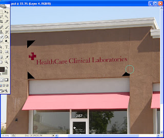
Now all I have to do is erase the triangles and we can see how the sign will look.
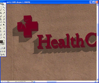
But I like to make my photo mock-ups to look more realistic, so I have added the edge of the letters and a shadow too. On the shadow layer I decreased the opacity so any building details would still show; like that crack you see below.
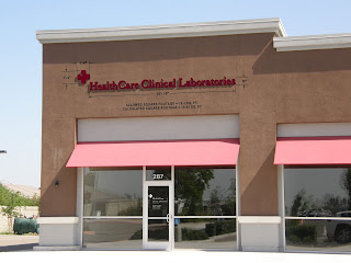
So below is the finished photo. Looks pretty real, doesn't it? But
il est faux! Nonetheless, it sold the job, so I'm happy.

Actually, I added the dimensions on the finished photo too because the customer has to get landlord approval and they will want to know not only what the sign will look like, but the size of it.
So anyway, that's what I do at work. And now that I've told you all my secrets so you could do this too, do you want a job?
 We make signs and part of our job is to show the customers how beautiful the proposed sign will look. So first I go out to their location and take a photo of the storefront.


 So below is the finished photo. Looks pretty real, doesn't it? But il est faux! Nonetheless, it sold the job, so I'm happy.


5 comments:
Fascinating!
It was interesting to see what you do. Gives me a visual idea of what you do. Thanks for sharing.
THAT is very cool!
What a neat job you have! More More!
That's amazing...I didn't realise such a thing was possible.
Wow, that is really good! That sign looks totally real. Do you need a copy editor?
Post a Comment